Film poster design: how to make key art that stops the scroll
Most people now see a film poster on a phone, at thumbnail size, between fifty other posts. Design for that first.
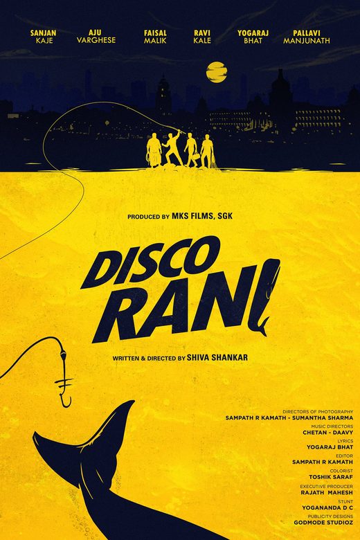
Key art used to be designed for a wall. Today its first home is a phone screen. That single shift changes almost every decision in poster design.
Design for the thumbnail first
Before approving a poster, shrink it to the size of an Instagram grid tile. Can you still read the title? Can you still tell what kind of film it is? If the answer is no, the poster is not finished, however beautiful it looks full size.
One idea per poster
The posters people remember usually carry one strong idea: a single face, a single object, a striking colour. Crowded posters that try to show every character and every plot point tend to blur together in a feed.
The title is part of the image
Title typography does as much work as the photograph. A good title logo tells you the genre before you read a word, and it has to hold up in every language version, on every size.
Character posters feed fan culture
In South Indian cinema especially, character posters are not filler. Fans share them, set them as wallpapers and build conversations around them. Each one should feel like a small reveal about the character, not just a portrait.
Colour as identity
A consistent colour language across the first look, character posters and trailer makes a campaign instantly recognisable. When people see the colour, they think of the film.
A poster has about two seconds. Everything on it should earn its place in those two seconds.